Repair Parts Tool
Role: Lead UX and UI Designer
Repair parts comprise a big chunk of the site's online sales, and the current experience and interface was cumbersome. It reminded me very much of cutting-edge technology in 1995, rather than the 21st century. While it checked the boxes, generally, of what someone would expect when they performed a search for a part, there was little to no attention paid to how a user moved through the tool, the interface was outdated and clunky, and the information wasn't structured in a manner that allowed for easy browsing.
Current State Audit
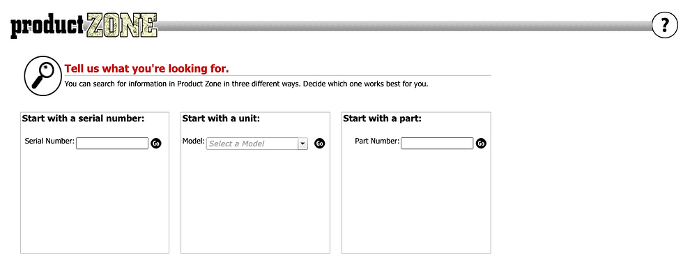
The tool's landing page had a triple search box design, which was confusing and inspired input errors.

After searching, the user landed on a pretty standard and usable table. But links don't really go where you'd think they would, and it's buggy and hard to use.

Relevant information is here, but the add to cart is hard to find (top left) and the replacement info, which is really important, is hard to make sense of.
The tool's landing page had a triple search box design, which was confusing and inspired input errors.
My initial thought on this project was excitement. I saw a huge opportunity to upgrade a tool our user's engage with every day, and updating and refreshing an older tool with modern technology and capabilities has immediate impact. The user flow itself felt quite natural and familiar: search; browse; select; purchase. However, as we dug into the data itself and found a slew of dependencies based on some older tables, the task become much harder.
Certain pieces of information could only be displayed in certain ways and under certain conditions. The design would have to be ultra-clear and hyper-flexible. Further, this is something that has been around for a while and user's have learned and internalized its peculiar idiosyncrasies.
In order to aid in adoption, I focused on evolution, rather than revolution. The new design should feel familiar, have a high utility, and ultimately, make it easier to buy repair parts.
Wireframes

I collapsed search into one box and cleared away almost all of the text. User's knew what to do, and this tested leagues better compared to the older version.

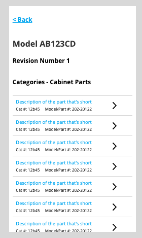
Throughout interviews, we found our user's mis-ordered parts often. I added a soft-stop with a select revision dropdown, to ensure they were on the right version to get the right part.
The images we have are currently low quality, so they are elided from the mobile view. The heuristic here focuses on speed and purchasing (not browsing), a big insight learned from our user research.
I collapsed search into one box and cleared away almost all of the text. User's knew what to do, and this tested leagues better compared to the older version.
A structured layout and information density were my primary concerns here. Some of the larger units have 100s of parts, and finding a structure where users could quickly and accurately find their part was tricky. I opted for an interior scrolling pane, using structure to put other, secondary elements either above or below this main selecting and image viewing section. Further, preventing errors was a concern, so the addition of the select revision pane was a big insight, both in lowering customer service calls and increasing accuracy of selection. These few pages had to do a lot of work, and after testing, I redesigned the table section a few times, tweaking and adjusting to help aid in comprehension.
Visual Design

With the simple, one box search field, I used a nice, clear, and branded red primary button to immediately draw the eye.
We try to minimize red in our designs (without removing it completely), so the blue serves as a nice, alternate color for highlighting elements.

The mobile view mirrors the wireframes very closely, but some subtle color and whitespace provide clearly defined actionable spaces and legible information.
With the simple, one box search field, I used a nice, clear, and branded red primary button to immediately draw the eye.
This is one of the first projects where I used the Design System I designed, and it performed pretty well. The tab structure had some challenges around laying out correctly, and my link styling initially got lost within the page. It was extremely valuable to test drive the design system on this project, and I could use the information I learned to improve all of the products. This version tested well, and I felt really comfortable going in to its launch. That should have been my first sign of trouble. After we launched, we hit some usability and navigation snags.
Users missed some on-page controls, and some older data that we thought was no longer useful was, in fact, super important for troubleshooting. We had evolved the tool. Now, we needed to iterate and tweak some features.
Iteration

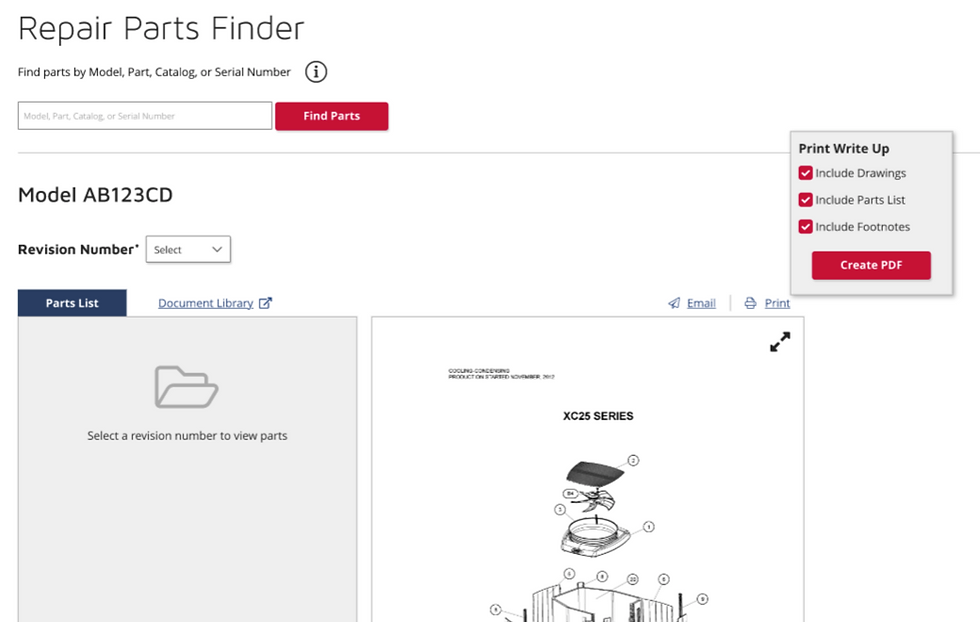
The first main change was adding a control to expand and collapse all. I moved up and redesigned the "all revisions" page for users who needed to see every version of a model. Finally, highly important technical notes now have an alert.

Users requested a few more pieces of information, such as quantity. I redesigned the accordion information, widening it and refiguring the structure.

Some of our models are extremely complex and have very specific information. I added an alternate pane within the drawing view to show this information, so user's can self-serve previously unavailable information.
The first main change was adding a control to expand and collapse all. I moved up and redesigned the "all revisions" page for users who needed to see every version of a model. Finally, highly important technical notes now have an alert.
Nothing beats the real world when it comes to usability. My research, testing, and overall design felt really solid. However, once it got into the real world, challenges quickly presented themselves with wayfinding and change management. We were able to quickly get those crucial insights and add a few new way finding features to help our users find the repair parts they needed for their business.