UX/UI: Components
Role: Research, Design
Introduction
My goal for this project was to create reusable components for our documentation website that would be controlled by ourCMS. Effectively, I created a mini-design system within our larger DS, focusing on the specific needs that our documentation website required.
In the initial creation of the site, images were used to highlight specific things on the site. This became cumbersome at scale. Standardized, coded components would be easier to implement, change, and generally control. Further, a wide variety of users would need to access, use, and edit these particular components, so any solution would need to be obvious, flexible, and wide-reaching.
Competitive Analysis & Problems

To begin, I performed a competitive analysis. I researched about 25 different systems, looking for moments of inspiration as well as pitfalls to avoid. This example is pretty good. I liked its simplicity and its clear color coding. However, the single line was a little wonky on larger runs of text. Further, I felt like the headline could be more illustrative.

Another comp analysis example. This one was more simple and pared down, and I appreciated the focus on the content, rather than the design itself. Line thickness and icon location were a good lesson learned here.

On some pages, there weren't clear headings as to what this section did. A user would just sort-of, stumble across it, with little signposting letting them know what they were looking at or why. An icon, a clear heading, and an overall standardization would help teach users what this section was and how to use it.
To begin, I performed a competitive analysis. I researched about 25 different systems, looking for moments of inspiration as well as pitfalls to avoid. This example is pretty good. I liked its simplicity and its clear color coding. However, the single line was a little wonky on larger runs of text. Further, I felt like the headline could be more illustrative.
As I begin most projects, I performed a quick competitive analysis and internal audit to glean an understanding of our initial problem space. First, clear headings are a must. What is a "do"? What is a "don't"? Users needs to know what they are looking at, quickly understand the instruction, and importantly, not be distracted by other stylized elements.
Second, standardization matters. When highlighting various things not to do, being able to rely on a stable structure is crucial in teaching users the necessary information, quickly. Any sort of loud design element or strange, non-standard reading experience was highly distracting. As was often the case, the instructions were fairly nuanced. Simplicity to highlight the content, rather than the design, was crucial.
Finally, functionality in building and maintaining the content was a key feature. Assets was currently quite cumbersome to create, edit, and maintain. Each individual section was an image in Figma, exported, and then uploaded to the site. Across the site, there were probably 500+ images for this one, single section. Any solution would need to address this scale problem, systematically.
Initial design & Functional Review

This was the initial design I proposed. The image is clear and obvious. The idea of "this is allowed" is supported by the green accent, the positive checkmark icon, as well as content that encourages use. Further, more explanations and further discussion is noted below the headline, for users who need more context as to why this is a best practice.

I presented my design to our team, which included designers, developers, and content strategists. Our team was quite thorough, so I created a quick doc where we could highlight sections for conversation, then a running text box where we could log questions, answers, and decisions made (and why). This particular question was around how images should be handled. Centered? Top, bottom-aligned?
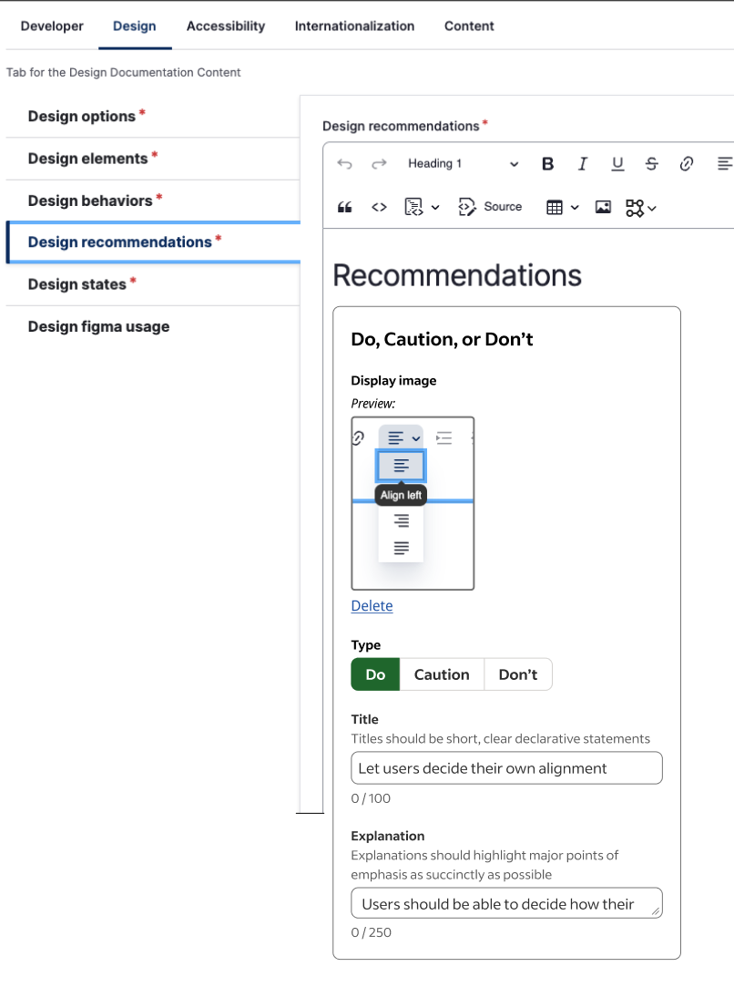
This is the after state of the Drupal mockup. Users can see which image they uploaded, what section this particular instruction belongs to, as well as some handy text boxes for editing text (rather than images).
This was the initial design I proposed. The image is clear and obvious. The idea of "this is allowed" is supported by the green accent, the positive checkmark icon, as well as content that encourages use. Further, more explanations and further discussion is noted below the headline, for users who need more context as to why this is a best practice.
After research and some exploratory design discussions, I created a basic design. Initially, my design followed a pretty simple structure: images; clear icon; headline; explanatory text. I wanted to begin the functional review as soon as possible to ensure that my design ideas were both feasible and able to be implemented.
The images above are some representative comments and problems we unearthed during both the design and functional review:
How should images behave within the container?
How much texts should we allow?
Where does this live in our CMS, and how do users interact with it?
Throughout this process, we learned quite a few things and found a few more questions to answer. How does this layout on the page? Which highlight works best when there are 10, 15 best practices to read?
One of the main problems we unearthed was quite simple. How do we handle something that doesn't need, or want, an image?
User Testing & Final Design

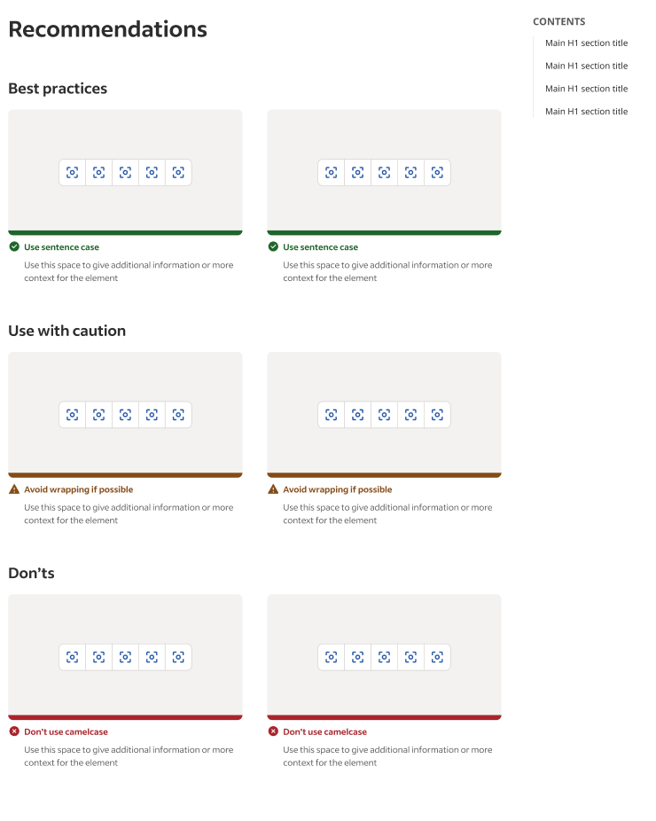
This was the final design we went with. I forwarded the text at the top of the box, giving users instructions and then an example. Further, clear color coordination makes this section standout, but not too much, at-a-glance.
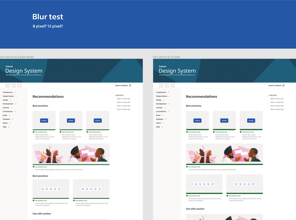
This a simple blur test I performed to see which elements of the page stood out, and which elements stood out too much. This helped dial in the visual design to be noticeable without dominating the page.
This is a snippet from a page we showed users to gain feedback on both the functional and the visual design.
This was the final design we went with. I forwarded the text at the top of the box, giving users instructions and then an example. Further, clear color coordination makes this section standout, but not too much, at-a-glance.
I did more testing and iterated on more designs. A really useful test was a blur test, which helped analyze text for visual weight relative to other elements. Further, I created a live page for user's to interact with and use. We ended up settling on a design that was clear, concise, and content-focused.
I used a clear icon to anchor's the user visually with a clear headline, easier for users to read and understand the content. Text immediately below the headline further explains the best practice, giving context where appropriate.
An image is shown below this opening visual block, using a simple visual example of what the text is instructing. This follows the mental model user's have when coming to the section: what am I supposed to do with this component; what does this instruction look like? Further, this design could be used both with and without an image. Content instructions and text-based best practices were clearly communicated while still following the structure of the entire section.
Overall, users responded well to the final design, and we launched the final component for use on the site with the goal of updating the entirety of the site shortly thereafter.