Information Architecture
Role: Design, Content
Introduction
We had recently relaunched a redesigned visual and content structure for Doc Hub, the Indeed Design System's documentation website. Metrics were good, and people liked the the new visual and structural changes we made.
However, the design system was continually growing, and at a base-level information architecture level, we still had a lot of work to do. The site had grown organically without oversight or any sort of ruleset to govern what pages go where. There were duplicate pages. There were pages that were largely blank. There were pages that were repetitive of other pages or worse yet, outdated completely. Our team set out to redo the entire site architecture for our design system, which totaled around 250+ pages.
To add more complexity, we had interest from other teams to put their documentation alongside the design system documentation, leveraging our team's expertise and abilities. In total, we had to organize around 6-8 different libraries of about 300+ pages, making sure users found not just information, but the right information.
Research: Mental Model Ideation

The Umbrella concept

The initial portal concept

Add all components in one space, with other information elsewhere.
The Umbrella concept
The ontology around this problem was particularly thorny. We had a working site, and while not as efficient as I'd like, people were familiar with it. After some time, they could learn how to use it. So not only did any new solution have to organize information successfully, it also would really benefit from being somewhat familiar to what users already used. We were flying the plane and building it at the same time.
Additionally, after researching about 30 design systems and an equal number of non-design system information spaces, I found our information set wasn't enough like other places where we could lean on other ideas. I would need to somehow combine a few different ontological methodologies in order to organize this information. To complicate matters, each library had their own team of people with strong thoughts and opinions on how not only their but everyone's information should be organized.
I initially mocked up a few, higher level more abstract structural styles for discussion. We analyzed each, discussing, designing, and testing each for their viability.
Design: Mockups

One idea kept the top-level navigation stable, while using a switcher in the top-right to move between information spaces.
Another idea would be keep the top-level categories stable, but provide a menu beneath each offering more complexity of categorization.

One idea was to lean on design and color palettes, creating individual sites that were complementary in design but internally different, handling the specific needs of each library.
One idea kept the top-level navigation stable, while using a switcher in the top-right to move between information spaces.
We settled on a design that would serve as a portal. We called our new site the Experience Hub, a one-stop place where anyone from any department within Indeed could access documentation that would help them solve their design, development, and content problems.
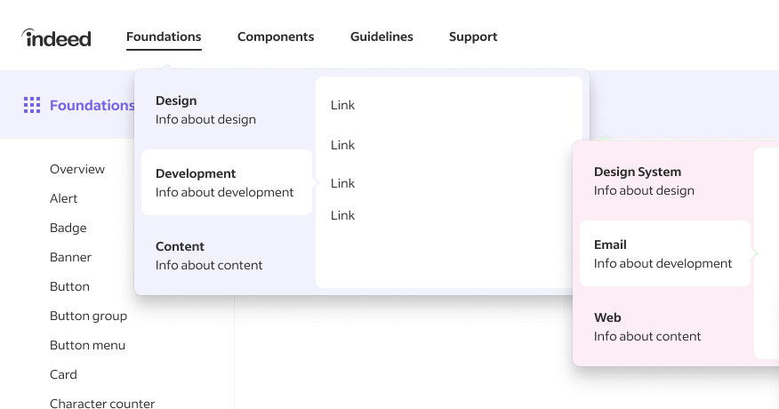
We would have stable, top-level navigation categories as well as a double navigation sub-category to point users in the right direction. Finally, we could reintroduce a highly simplified left-rail where users could further narrow down which piece of information they required.
The navigation categories were simple, easy to skim, and easy to act on both within across categories but also across categories. Complex problems sometimes require complex solutions, and this is one of those times. The volume of information we were dealing with required multiples places of signposting to ensure the user always felt certain they knew where they were within this complicated space.
Final Design

The refigured homepage would highlight the breadth of information while still focusing on action, encouraging users to get into the interior of the site.

The double navigation, coupled with highly contextual left-rail navigation helped users locate specific pieces of information both quickly and accurately.

The full sitemap of EH was quite large, but laying it out visually in this manner helped stakeholders understand the overall vision and ultimately, get on board with the transition,
The refigured homepage would highlight the breadth of information while still focusing on action, encouraging users to get into the interior of the site.
The final design featured a new homepage and the addition of both a second and third level navigation options. Overall, we spent months on this project, meeting twice weekly to review design and IA integrations that I had performed, and countless meetings with stakeholders across multiple departments to ensure this new design not only functioned well in aggregate but for individual groups.
I led a department-wide presentation to garner buy-in both internally and externally, and the project was enthusiastically received and approved.